Web Design Trends for 2017
Bryn Irwin, January 2017
The web is constantly evolving at a rapid pace. Devices for browsing the internet emerge and evolve very quickly. Development tools and technologies constantly evolve to compliment the new ways people are exploring content. With these ever improving devices, tools and technologies comes greater challenges when designing interfaces, but the outcomes allow for greater flexibility and more impressive results.
Here's some web design trends to look out for in 2017.
Google's Material Design Project
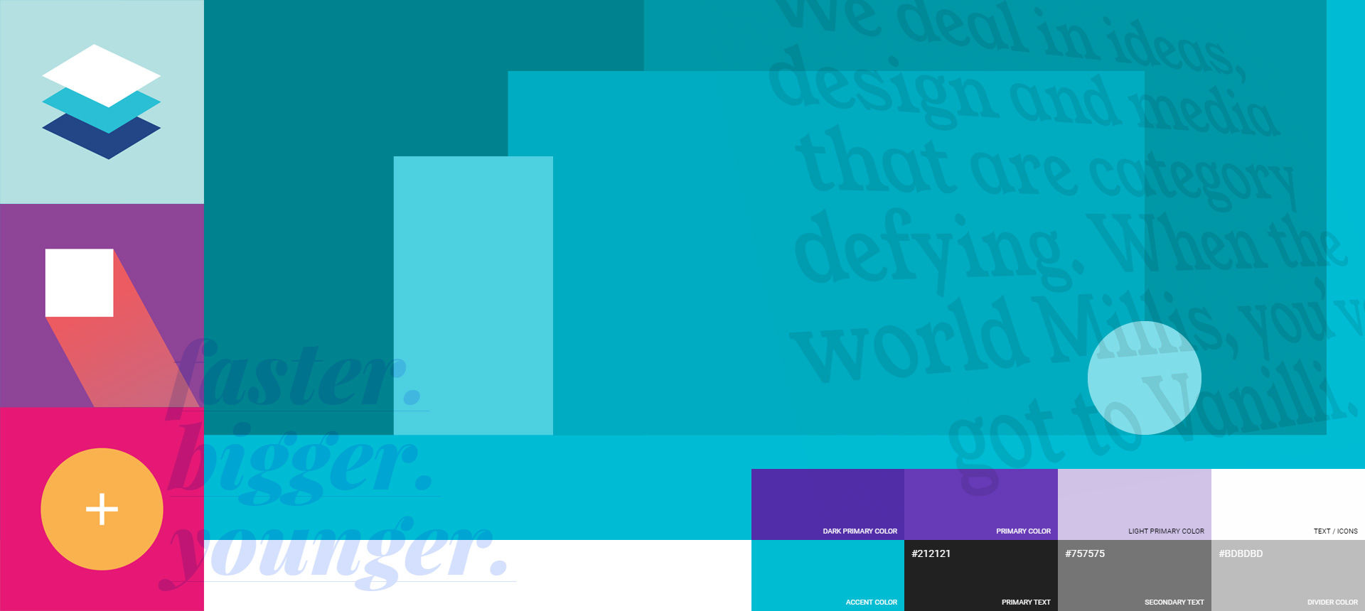
Material is the metaphor - Bold, graphic, intentional - Motion has meaning.
Google has published a new suite of tools and open source projects to help make the design process better for both users and designers. It started back in 2013 when Google decided they needed a guiding principle for all their own products and applications. If you remember how different the gmail experience used to be between gmail.com, gmail's android app and mobile gmail.com, you'll understand why they started down this path.
A taste of their own medicine.
Google introduced the new system and design approach, called Material Design and has been applying it to their own apps ever since. And in Google's sharing way, they released it to the world as an ongoing open-source project. Free to the people.
Why 2017?
Good things take time. While those on the cutting edge have been aware of Material Design since its inception, the reality is 2017 will be the year this approach will start to gain momentum and stand out as the norm.
What to look for:
Specifically look for things like responsive layouts - in material design, creations adapt to any possible screen size. Also look for bold colour palettes.
Bold, Creative Typography
Expect headings that will take up more screen space. We're in a time of instant gratification, and if you want to capture the attention of your users you have mere seconds before they'll be off in some other direction. Big, bold and interesting statements will be used to grab and hold the users attention (we're doing it right here on our website!).
You'll also start seeing more creative typefaces than the standard 'safe' web fonts. Improvement in browser support for a broader base of fonts, combined with better data speeds have enabled designer to expand their options of font choice.
Modular Design
While modular design isn’t new, it's been gaining more momentum recently. Modular design encourages you to think and design a UI and UX using repeating patterns. It's a design approach using a modular block and grid patterns to layout elements.
It leads to a consistent system that's flexible, scalable and cost-efficient through re-use, but also completely customisable.
If it's good enough for Pharrell and Beyonce you can bet you'll see it being used more and more this year.
The end of the homepage header Carousel
Maybe not the end, but they'll be used less and less. Designers are moving away from them because all they achieve is hiding content. If something's been assigned the 5th position in a carousel - it speaks volumes for how important it's been considered. Or another way to look at it... if something's really important and deserves to be on the homepage, don't hide it behind a bunch of other items.
You'll start noticing new, more unique ways to attract attention on the homepage, like this compelling imagery on Nike homepage, or use of subtle animations like ASB use. Or, use of bold colour/contrast or ambient video. And for the more tech-savvy, SVG masking (layered curves or diagonals) for super lightweight, impressive use of colours.
Component Design
Component design is an approach or design process... maybe less evident in the visual outcome, but none the less gaining momentum among web designers. Instead of mocking up entire layouts for a particular website design, using component design methodology, designers break them down into various components.
A component could be any small part of the bigger picture e.g. how the search function will work, how the navigation will be laid out, what a content card will look like.
Brad Frost's Atomic Design would be one of the most well respected definitions for component design. He breaks the process down into the following five distinct levels:
- Atoms
- Molecules
- Organisms
- Templates
- Pages
Each level being a building block for the next level enabling interfaces to be built up from smaller components. This means designers can separate entire user interfaces down into their building blocks and assemble them from there.
Bringing It All Together
You might have noticed the trends highlighted in this article are overlapping and combining in some of the example designs provided. None of the topics covered need to work in isolation, and given these are all trends to look out for, it stands to reason the best designs will incorporate many of them.
Bringing it all together, here’s a great example of contemporary web design from NZ's own LetterBoxd - making use of almost all these trends. Or Taste Kapiti is another local example.


